Fastshot
Prompts (咒语)
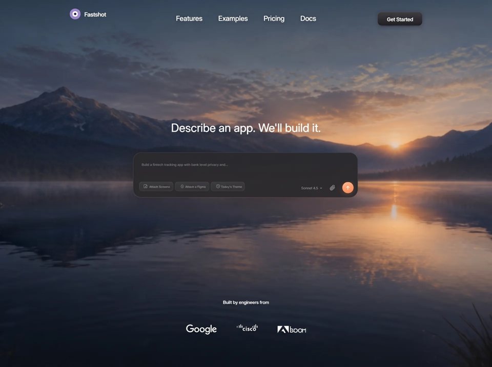
Recreate this page as ONE self-contained HTML file (inline CSS + JS). Match it pixel-faithfully. Do not invent extra sections, extra pages, extra copy, or a different visual language. The entire website is this single full-viewport hero. ════════════════════════════════════════════════════════════════ CRITICAL — COMPOSER RIGHT CLUSTER (this is where one-shot gens fail) ════════════════════════════════════════════════════════════════ The bottom of the prompt card is ONE toolbar row. Left: three chips. Right: “Sonnet 4.5”, paperclip, orange send circle. DO NOT do any of the following (these are the usual mistakes): - wrapping model + attach + send in a flex row with align-items:center - giving the send button the same height as the chips - vertically centering the send circle with the “Sonnet 4.5” text - putting the send button on its own row or in the card’s vertical center - adding padding/min-size around the paperclip (it is a raw SVG, not a padded icon button) - using gap: 8px / 12px / 16px guesses between those three controls DESKTOP MUST use absolute coordinates inside the toolbar, copied from the measured 1560×1008 frame. Card (absolute frame coords): x=425, y=413, w=708, h=143, radius=26 Toolbar strip (.tools) inside the card: left = (444 − 425) = 19u from card left top = (505 − 413) = 92u from card top height = 30u ← this is the CHIP row height right ≈ card right (formula: right: calc((425 + 708 − 1134)*var(--u)) which is −1u) Chips fill that 30u-tall strip. The send circle is TALLER than the chips and is NOT centered on them. RIGHT CLUSTER (.right): position:absolute; inset:0; pointer-events:none each child: position:absolute; pointer-events:auto (left offsets are relative to .tools, whose left edge is frame-x 444) MODEL “Sonnet 4.5” + chevron left: (955 − 444 − 0.8) = 510.2u top: 15.5u font-size: 10.4u, weight 400, color #98999C, line-height 1 display:inline-flex; align-items:center; gap: 6.2u chevron SVG width: 6.8u The 10.4u text sits in the LOWER-MIDDLE of the 30u chip row (top 15.5 + height 10.4 = 25.9, so it sits above the chip baseline, not vertically centered with the 35u send). ATTACH paperclip left: (1043.15 − 444) = 599.15u top: (515.14 − 505) = 10.14u color #A9AAAD SVG width: 19.79u (no button padding, no background, no 32px hit box) hover color #fff SEND circle left: (1084 − 444) = 640u top: (507 − 505) = 2u size: 35 × 35u, border-radius 50% So: send top is 2u below the chip-row top; send bottom is at 2+35=37u, which HANGS 7u BELOW the 30u chip row. Right padding: card right (1133) − send right (1084+35=1119) = 14u from the card’s inner right edge. Horizontal gaps (do not invent others): attach right ≈ 599.15+19.79 = 618.94u send left = 640u gap attach→send ≈ 21.06u model starts at 510.2u; leave the natural width of “Sonnet 4.5” + 6.2u + chevron; do not stretch it. VISUAL CHECK (desktop screenshot): All three chips, the model label, the paperclip, and the send circle share one horizontal band near the BOTTOM of the glass card. Placeholder text is a separate band near the TOP of the card (33u from card top). Two bands, not one. The orange circle is the largest control on that band. Chips are 30u tall pills. Send is a 35u circle that slightly overshoots the chip row downward. “Sonnet 4.5” is small muted text sitting left of the paperclip, vertically aligned to the chip TEXT, not to the send circle’s center. Paperclip sits between the model label and the send circle, slightly higher than the model text, lower than the send’s top. TABLET (600–1180 wide AND height ≥ 600) is the ONLY place the right cluster becomes flex: .right { position:static; display:flex; align-items:center; margin-left:auto; gap:0 } .right > * { position:static } .attach { margin-left: clamp(9px, 1.4vw, 20px) } .send { margin-left: clamp(9px, 1.3vw, 18px); width/height: clamp(32px, 3.5vw, 38px) } Toolbar stays ONE ROW: chips left, controls right. Do not wrap the send onto a second row. PHONE (max-width 599, or height < 600 with width ≤ 1180): .tools { flex-direction:column; align-items:stretch; gap:12px } chips wrap on row 1 .right { position:static; display:flex; align-items:center; justify-content:flex-start } .attach { margin-left:auto } ← paperclip + send hug the right; model stays left .send { margin-left:14px; width:40px; height:40px } Still not a centered send. Model left, attach+send right, same second row. ════════════════════════════════════════════════════════════════ PRODUCT ════════════════════════════════════════════════════════════════ Fastshot landing hero. <title>Fastshot — Describe an app. We'll build it.</title> <meta name="description" content="Fastshot turns a written description into a working app."> viewport: width=device-width, initial-scale=1, viewport-fit=cover BACKGROUND VIDEO (REQUIRED — this exact URL, no substitute, no still image) https://d8j0ntlcm91z4.cloudfront.net/user_38xzZboKViGWJOttwIXH07lWA1P/hf_20260826_124724_bc041163-d651-425f-aea3-2acc1efc2c96.mp4 <video> covering the full viewport: autoplay muted loop playsinline, object-fit:cover, z-index 0. Page behind it: #0a0d12. html/body height 100%, body overflow:hidden. The video is a dawn lake-and-mountains landscape. CSS must not pan/zoom/ken-burns it. UI sits on top. FONTS Google Fonts Inter variable: opsz 14..32, wght 100..900, font-display:block --font-text: Inter, -apple-system, "Segoe UI", Roboto, Helvetica, Arial, sans-serif --font-display: Inter, var(--font-text) Display roles: font-variation-settings: "opsz" 32 body: font-synthesis:none; -webkit-font-smoothing:antialiased; -moz-osx-font-smoothing:grayscale; text-rendering:geometricPrecision Weights actually used (do not synthesize others): 400, display 410, 480 proof, 500 brand/labels, 520 CTA REFERENCE LAYOUT (DESKTOP) Frame 1560 × 1008. 1 unit (--u) = 1 reference px. :root { --u: min(0.06410256vw, 0.12400794vh); --vu: 0.09920635vh; --inset-top: 41; --inset-bottom: 106; } @supports (height:100dvh) { --u: min(0.06410256vw, 0.12400794dvh); --vu: 0.09920635dvh; } @media (min-width:1561px) { --inset-top:27; --inset-bottom:74; } The composition scales as one block and is never clipped. Video always covers the viewport (no letterboxing). CSS VARIABLES (copy exactly) Nav: --brand-x:225; --brand-y:45; --mark:34; --brand-gap:12; --brand-fs:18.49; --links-y:50.5; --links-gap:50; --links-fs:21.69; --cta-x:1195; --cta-y:42; --cta-w:140; --cta-h:43; --cta-r:12; --cta-fs:15.70; --cta-dy:2; Hero: --hero-gap:51; --h1-y:323; --h1-fs:36.25; --display-ls:0.0018em; --nav-ls:-0.0115em; --brand-ls:-0.0154em; --cta-ls:-0.0127em; --body-ls:0.007em; --label-ls:normal; --model-ls:normal; --proof-ls:0.0065em; --w-regular:400; --w-display-wght:410; --w-medium:500; --w-semibold:600; --w-display:var(--w-display-wght); --w-nav:400; --w-brand:500; --w-cta:520; --w-body:var(--w-regular); --w-label:var(--w-medium); --w-model:var(--w-regular); --w-proof:480; Composer: --card-x:425; --card-y:413; --card-w:708; --card-h:143; --card-r:26; --ph-x:452; --ph-y:446; --ph-fs:9.97; --chips-x:444; --chips-y:505; --chip-h:30; --chip-r:9; --chip-fs:9.0; --chip-gap:5.5; --son-fs:10.4; --son-top:15.5; --chev-gap:6.2; --chev-x:1013.5; --chev-y:522.3; --att-x:1043.2; --att-y:515.1; --send-x:1084; --send-y:507; --send-d:35; Footer: --by-y:799; --by-fs:14.01; --logo-y:867; --logo-gap:62; PAGE STRUCTURE .stage (position:fixed; inset:0; overflow:hidden; background:#0a0d12) .stage-video (absolute; inset:0; width/height 100%; object-fit:cover; z-index:0) .frame (absolute; inset:0; z-index:1; flex column) padding: calc(var(--inset-top)*var(--vu)) calc(225*var(--u)) calc(var(--inset-bottom)*var(--vu)); hidden checkbox #menu header.nav (height: calc(43*var(--u)); flex; align-items:center; justify-content:space-between) .sheet (mobile menu; display:none on desktop) main.hero (flex:1; column; align center; justify center; gap: calc(var(--hero-gap)*var(--vu)); padding-bottom: calc(4*var(--vu))) footer.proof (flex:none; column; align center; gap: calc(52.3*var(--vu))) NAV LEFT — brand Link “Fastshot”, aria-label “Fastshot home” Mark 34×34: circle #9C86CE r=17, circle #FFFFFF r=8.6, circle #151519 r=3.7 Wordmark: Inter, 18.49u, weight 500, letter-spacing -0.0154em, translateY(1u), opsz 32 text-shadow: 0 1u 10u rgba(0,0,0,.30) gap 12u NAV CENTER — absolutely centered position:absolute; left:50%; transform:translateX(-50%); top: calc((50.5 − 41)*var(--u)); gap 50u Features · Examples · Pricing · Docs (href="#") 21.69u, weight 400, Inter, letter-spacing -0.0115em, line-height 1.2, white text-shadow: 0 1u 12u rgba(0,0,0,.32) hover opacity .72, transition opacity .18s ease NAV RIGHT — Get Started 140×43u, radius 12u, Inter 15.70u, weight 520, letter-spacing -0.0127em align-self flex-start; margin-top: calc((42 − 41)*var(--u)) background: linear-gradient(180deg, #3d3d3f 0%, #1d1d20 100%) box-shadow: inset 0 1u 0 rgba(255,255,255,.10), 0 2u 14u rgba(0,0,0,.28) inner span translateY(2u) hover filter:brightness(1.16); active translateY(1px) HEADLINE “Describe an app. We'll build it.” Inter, 36.25u, weight 410, line-height 1.10, letter-spacing 0.0018em, white, opsz 32 text-shadow: 0 2u 22u rgba(0,0,0,.30) COMPOSER CARD <form class="card" onsubmit="return false"> 708×143u, radius 26u, margin-right: 3u background: rgba(41,41,43,.955) backdrop-filter: blur(26u) saturate(112%) box-shadow: inset 0 0 0 1px rgba(214,228,255,.14), 0 22u 60u rgba(0,0,0,.30) position:relative (required so .ph and .tools can be absolutely placed) PLACEHOLDER (a <p>, not an input) “Build a fintech tracking app with bank level privacy and...” position:absolute left: (452−425)=27u top: (446−413)=33u right: 24u color #8B8C8E, 9.97u, weight 400, line-height 1.35, letter-spacing 0.007em white-space:nowrap; overflow:hidden CHIPS (left side of the 30u toolbar) .chips { display:flex; align-items:center; gap: 5.5u } Each chip: height 30u, radius 9u, font 9.0u weight 500, color #909093, line-height 1 background: linear-gradient(180deg, rgba(255,255,255,.088) 0%, rgba(255,255,255,.050) 45%, rgba(255,255,255,.038) 100%) border: 1px solid rgba(255,255,255,.05) hover: linear-gradient(180deg, rgba(255,255,255,.14), rgba(255,255,255,.07)); color #c8c8cb label span translateY(2u) Chip 1 “Attach Screens” style="--cw:107;--pl:12;--ig:3.7" icon width 15.06u Chip 2 “Attach a Figma” style="--cw:108;--pl:16;--ig:3.9" icon width 11.8u Chip 3 “Today's Theme” style="--cw:107;--pl:15.8;--ig:2.9" icon width 12.13u Icons are FILLED currentColor blob paths (not outline/stroke icons). SEND STYLING background: linear-gradient(163deg, #FBBC94 0%, #F49D70 46%, #E88654 100%) box-shadow: 0 3u 12u rgba(210,110,60,.34) white filled UP-arrow SVG, width 11.66u, flex-centered in the circle aria-label “Build it” hover brightness(1.07); active scale(.95) FOOTER “Built by engineers from” Inter, 14.01u, weight 480, letter-spacing 0.0065em, color rgba(255,255,255,.95), opsz 32 text-shadow: 0 1u 12u rgba(0,0,0,.35) Three white wordmark SVGs, gap 62u, drop-shadow 0 1u 10u rgba(0,0,0,.30) Google 96.84u · Cisco 67.29u · Adobe 88.68u Filled currentColor wordmarks (white on the photo). FOCUS :focus-visible { outline: 2px solid #F8B285; outline-offset: 3px; border-radius: 4px; } Reset: *,*::before,*::after { box-sizing:border-box; margin:0; padding:0 } button,input,textarea { font:inherit; color:inherit; background:none; border:0 } img,svg { display:block } MOBILE MENU Burger 38×38, radius 11, background rgba(255,255,255,.10), border 1px solid rgba(255,255,255,.14), two-bar icon 17×12 CSS-only: hidden checkbox #menu + label.burger .sheet: grid-template-rows 0fr → 1fr, 0.32s cubic-bezier(.4,0,.2,1) Panel: rgba(24,24,27,.86), blur 20px, radius 16, border rgba(255,255,255,.09) Links 15px; Get Started height 40, radius 11, font 15 RESPONSIVE — implement all three architectures 1) DESKTOP (default): unit-scaled 1560×1008 composition above. .burger and .sheet { display:none }. Absolute toolbar as specified. 2) TABLET: @media (min-width:600px) and (max-width:1180px) and (min-height:600px) --u: 1px Fluid DESKTOP, not phone. One-line headline. ONE-ROW toolbar (chips left, controls right). .frame padding: clamp(24px,3.4vh,44px) clamp(28px,4.2vw,60px) clamp(26px,4.4vh,56px) Nav stays horizontal with all four links + Get Started visible. .h1: clamp(27px,4.3vw,44px); line-height 1.12 .card: width min(100%, clamp(516px,74vw,760px)); height:auto; margin-right:0 padding clamp(15px,1.9vw,24px); radius clamp(17px,2.1vw,26px) display:flex; flex-direction:column; gap: clamp(20px,3.2vh,44px) .ph: position:static; white-space:normal; clamp(11px,1.35vw,14px); line-height 1.4 .tools: position:static; height:auto; display:flex; flex-direction:row; flex-wrap:wrap; gap: clamp(10px,1.4vw,18px) .chips: nowrap; gap clamp(6px,0.85vw,10px) .chip: width:auto; height clamp(29px,3.4vh,34px); padding 0 clamp(7px,1vw,13px); font clamp(9.6px,1.12vw,12.5px) .model: clamp(9.8px,1.12vw,12.5px) Proof gap clamp(15px,2.5vh,30px) 3) COMPACT: @media (max-width:599px), (max-height:599px) and (max-width:1180px) --u: 1px padding: max(18px, env(safe-area-inset-top)) max(clamp(18px,5.2vw,40px), env(safe-area-inset-right)) max(20px, env(safe-area-inset-bottom)) max(clamp(18px,5.2vw,40px), env(safe-area-inset-left)); Hide .links and header .cta. Show burger. Brand 30px mark. .h1: width 100%; max-width:15ch; clamp(29px,7.6vw,50px); line-height 1.14; letter-spacing -.012em .card: width 100%; max-width 600px; height auto; column; gap clamp(16px,4.6vh,34px); padding clamp(13px,3.4vw,18px) .ph: nowrap ellipsis; clamp(9.4px,2.95vw,14px) Extra short: @media (max-width:1180px) and (max-height:560px) { .hero gap 16px; .h1 clamp(24px,5.4vh,34px); .proof gap 10px; padding-top 10px } ENTRANCE (once on first paint; never loops; not scroll-bound) Head script: document.documentElement.classList.add('anim') Only under prefers-reduced-motion: no-preference --e-primary: cubic-bezier(.16,1,.3,1) --e-soft: cubic-bezier(.22,1,.36,1) @keyframes: e-settle-down opacity 0, translateY(-5u) → none e-settle-up opacity 0, translateY(6u) → none e-mark scale(.9) → none e-focus opacity 0, translateY(14u), blur(6u) → none / blur 0 (headline only) e-panel opacity 0, translateY(18u) scale(.985) → none e-populate opacity 0, translateY(4u) → none e-send scale(.82) → none animation-fill: both brand e-settle-down .58s soft .06s mark e-mark .62s primary .06s nav links e-settle-down .50s soft .16s, stagger +0.05s (.16 .21 .26 .31) Get Started e-settle-down .55s soft .34s headline e-focus 1.00s primary .30s composer e-panel .90s primary .62s placeholder e-populate .50s soft .88s chip row e-populate .50s soft .94s .right e-populate .50s soft 1.00s .send e-send .50s primary 1.00s proof caption e-settle-up .55s soft 1.08s logos e-settle-up .55s soft 1.16s, stagger +0.06s (1.16 1.22 1.28) will-change transform,opacity on .h1 and .card while animating After last logo animationend OR 2600ms timeout: remove class "anim" from <html> prefers-reduced-motion: reduce → animation/transition duration .01ms INTERACTION Chips / model / attach / send are presentational. Form does not submit. Links are "#". No JS except the anim class + teardown. Mobile menu is the checkbox. OUTPUT One HTML file. Dark full-bleed hero. Match colors, radii, shadows, letter-spacing, and the three responsive architectures. Do not add a second section below the fold. Desktop composer: absolute toolbar. Right cluster is NOT a flex-centered group.
复制到 Lovable、Cursor、Claude、Codex、Google AI Studio 等 AI 工具生成